Entrain ligand-velocity analysis in Python
entrain_velo_python.RmdEntrain ligand-velocity analysis from an Anndata object in Python.
This document outlines a basic Entrain analysis starting from an
scverse anndata object with pre-calculated
velocities. By the end of this document, you will identify ligands that
are driving the velocities in your data.
Prior assumptions: Entrain-Velocity Analysis requires the following:
- Single-Cell RNA data on a dataset of cells differentiating as well as data on their microenvironmental niche.
- A
.h5adobject produced by scvelo that contains robust velocity data. Please ensure that your biology you are interested in is conducive to producing trustworthy velocities.. - You have (some) idea of which cell clusters comprise the ‘niche’, or ligand-expressing cells, in your dataset.
Pre-processing and loading required data.
Conda setup.
We recommend using conda to setup a python environment that contains the required packages for velocity analysis.
conda create -n entrain-velocity
conda activate entrain-velocity
conda install -c conda-forge scanpy leidenalg python-igraph adjustText loompy matplotlib seaborn scikit-learn
conda install scvelo
pip install pypath-omnipath
pip install entrain
We can then load in our libraries in python
import entrain as en
import pandas as pd
import anndata as ad
import scvelo as scv
Downloading required data
First, we will download an example dataset of a developing mouse brain atlas dataset at gestation day 10/11, as well as required regulatory network information.
Entrain relies on the NicheNet database of ligand-receptor-gene networks for the prior knowledge needed to make conclusions about environmentally-influenced trajectories. The genes here have been pre-converted from the original human genes to mouse orthologs.
ligand_target_matrix_mm = pd.read_csv("ligand_target_matrix_mm.csv",index_col=0)
adata = ad.read_h5ad("Manno_E10_E11.h5ad")
Data at a glance
The data consists of cells in the developing mouse brain at day 10 after gestation. This comprises a population of neuroblasts rapidly differentiating to neurons (our cells we are going to analyse), as well as their complex microenvironment made up of cells from the endoderm, mesoderm, fibroblastic, blood, and immune compartments.
scv.set_figure_params()
sc.pl.umap(adata, color = "Class", save = "manno_python_umap.png")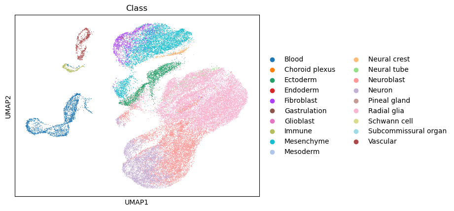
Run Entrain from a velocity anndata object.
Entrain fully integrates the scvelo package for velocity analysis. Below are the main steps:
Clustering Velocities
- First, cluster velocities into groups of similar velocity dynamics.
The resultant velocity clusters (or
vclusters) are a separate entity from the usual cell annotation clusters. Cells of the same celltype cluster may not necessarily be in the same velocity cluster.
adata = en.cluster_velocities(adata, resolution=0.05)
en.plot_velocity_clusters_python(adata,
                                 plot_file = "plot_velocity_clusters.png",
                                 velocity_cluster_key = "velocity_clusters")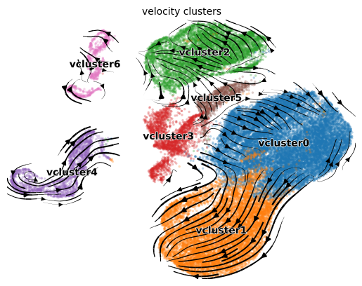
We can see that the velocity clusters roughly, but not exactly, correspond to cell type clusters, indicating that velocities are moderately correlated with cell type.
Note that as of July 2023, there is a bug in scvelo
that prevents plotting. See https://github.com/theislab/scvelo/issues/1098
Recover Dynamics
Velocity likelihoods for each cluster are then calculated via scvelo, to feed into later Entrain analysis.
adata = en.recover_dynamics_clusters(adata,
                              n_jobs = 10,
                              return_adata = True,
n_top_genes=None)- Note that as of July 2023, there is an existing bug in
scvelo.tl.recover_dynamics(). Using `numpy version 1.23.5 may fix the problem. Also see #1058.
If some of your clusters contain few cells, you may get numerous
warnings
e.g. WARNING: TDRD6 not recoverable due to insufficient samples..
This is expected in clusters that contain few cells. If you’d like to
remove these clusters from further analysis, you can specify the
argument vclusters = in the next step.
Fitting Ligands to Velocities
We will also save the resulting .h5ad object for plotting our results afterwards.
sender_cluster_names = ["Blood", "Fibroblast", "Immune", "Mesoderm"]
adata = en.get_velocity_ligands(adata,
                                             organism="mouse",
                                             sender_clusters=sender_clusters,
                                             sender_cluster_key = "Class",
                                             ligand_target_matrix=ligand_target_matrix_mm)
Visualizing results
At a glance
We can visualize the top ranked ligands at a glance with the function
plot_velocity_ligands_python. By default, the function only
visualizes results with positive variance explained, with the assumption
that negative variance explained denotes poor model accuracy.
en.plot_velocity_ligands_python(adata,
                                cell_palette="plasma",
                                velocity_cluster_palette = "black",
                                color="velocity_clusters",
                                plot_output_path = "manno_entrain_python.png")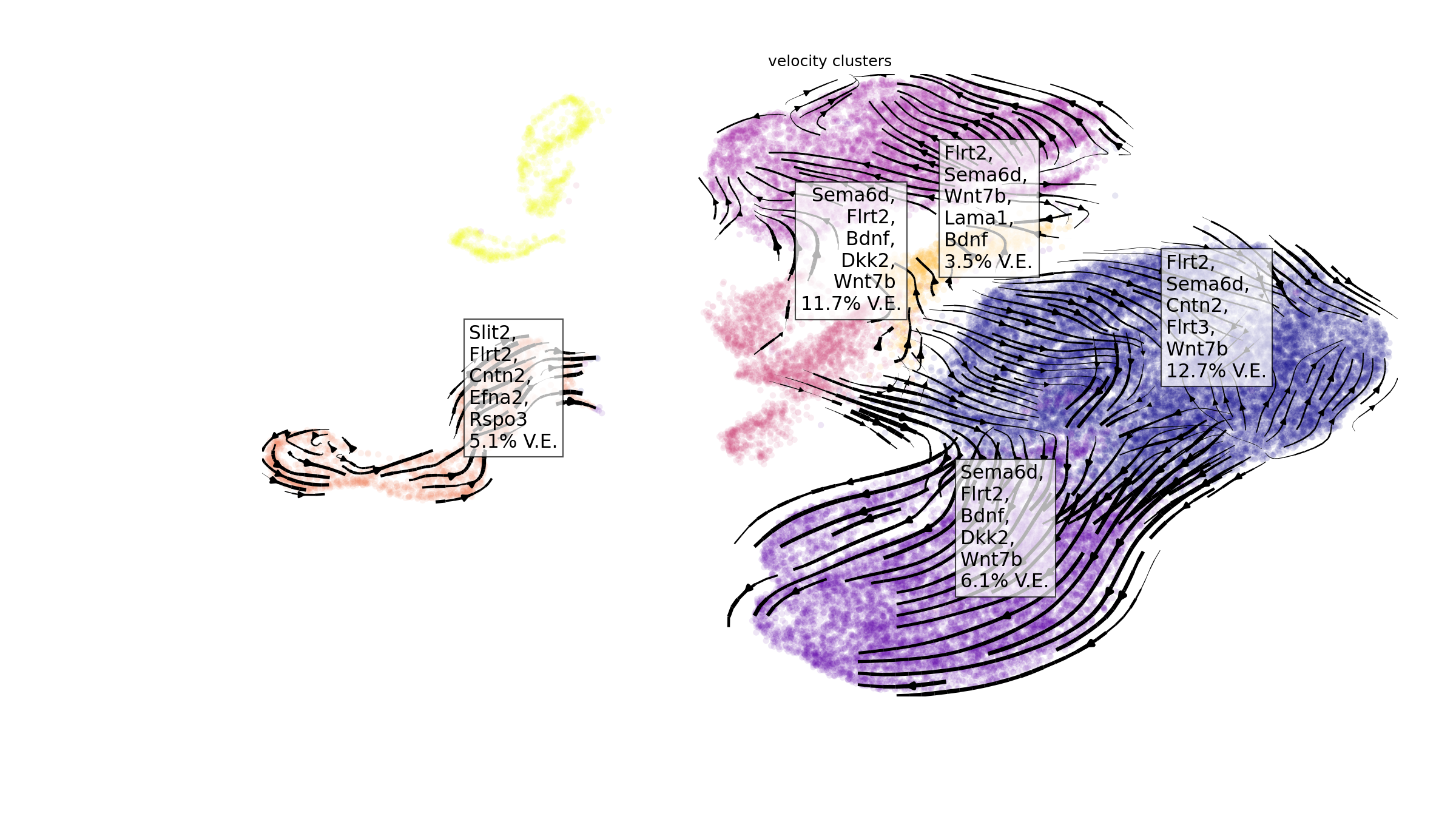
Sender Cell Visualization
Visualization of cells that express the ligands found in our
analysis. Cells are coloured based on mean expression of the
top_n_ligands predicted to be driving velocities in the
velocity cluster.
vclusters_to_plot = ["vcluster0", "vcluster1", "vcluster2", "vcluster3"]
plot_sender_influence_velocity(adata= adata,
                                   velocity_clusters = vclusters_to_plot,
                                   title = "velocity_sender_influences_python.png")
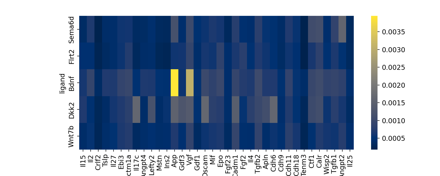
Visualizing ligand importances
Visualization of ligands and their relative importances, or
contribution, towards each vcluster.
en.plot_ligand_importance_heatmap(adata, filename="importance_heatmap.png")
Visualizing high velocity likelihood genes
Commonly, a small proportion of the total genes contribute the
majority of the observed RNA velocity dynamics. You may wish to
visualize these genes by plotting the top likelihood genes as a sanity
check to confirm that scvelo is appropriate for your
biological system. These genes are the ones found by scvelo
to most robustly fit the underlying theoretical model. The function
plot_likelihoods_heatmap plots, as a heatmap, the
n_top_genes ranked by velocity likelihood for each velocity
cluster.
en.plot_likelihoods_heatmap(adata, filename="manno_python_likelihoods_heatmap.png")
Visualizing intracellular regulation downstream of the ligand-receptor pair.
The function plot_ligand_targets_heatmap extracts
regulatory information from NicheNetR to visualize the
predicted regulatory linkages between the n_top_ligands and
the top velocity likelihood genes.
en.plot_ligand_targets_heatmap(
        adata,
        ligand_target_matrix,
        velocity_cluster = "vcluster1",
        filename = "velocity_ligand_targets.png")